Sunday 8 May 2011

Front Cover, Contents Page, Double Page Spread & Mood Board


Front Cover
Above is the final version of the front page. It follows the codes and conventions in some ways because the bar code is located in the bottom right hand corner with a website written below it. The website was written in order to give promotion to the company. Also as you can see there is a black lightening bolt with 'FREE CD INSIDE' written across it. This is a lure, as the readers will be more likely to buy a magazine if there are enticements. The 'Free Posters Inside' is also a lure. 

Contents Page
Above is a final version of the contents page. As you can see it has very bright colours, which will catch the eye of the reader. There are no lures on this page. As you can see the main image is an eye-level long shot of Jenai. The graffiti on the ramp in which Jenai is stood, is also eye-catching. Where there is a black star and it says 'Subscribe! Just Visit www.moesh.com/subscribe' this is also in some ways promoting the company with the website. 

Double Page Spread
Above is the final version of the double page spread. As you can see it's very different from the front page and contents as the colours are not quite as bright. There are 5 different images used on this, whereas on the contents and front page there is only one image. This page follows the codes and conventions of real magazines in some ways, because as you can see i have written a quote and made it stand out by placing it on a eye-catching shape. 

Mood Board
Lastly, above is my mood board. It includes most of the pictures which i used on the front page, contents and double page spread. It also includes two of the fonts which i used and the main colours which are used in my work.

Wednesday 4 May 2011

Question 3: What kind of media institution might distribute your music magazine and why?

Our target audience as you know is those who appreciate rap and urban music. There is a gap for this in the market as there are hardly any rap magazines. 'Vibe' magazine, the magazine i mentioned previously, isn't actually a rap magazine, but its a music magazine that often features rap artists. It is a niche market because obviously its only a small part of the population that enjoy that kind of music.

I believe that the magazine institution that would distribute our magazine is 'Bauer'. The reason i think this is because i researched Bauer and it appears they distributed other music magazines/channels for example; 4Music,  Kerrang, Kiss 100, and many more.


Above is the logo for Bauer Media. It appears from the research i have done that this company have experience with our kind of magazine, as they have distributed others like it.

I believe that 'Emap' is the company that would definitely not distribute our magazine. The reason for this is because that company focus on digital media, broadcasting in particular, advertising and film.

Tuesday 3 May 2011

Question 2: How does your music magazine represent particular social groups?

In our music magazine we have represented no particular social group, we have just tried to aim it mostly at our target audience. And our target audience is those who enjoy rap music. Like i have stated before, we wrote not formal, but not informal either so that way we can get everyone involved with the magazine and everyone will be able to understand it. The way Jenai is posed in the pictures has a little bit of attitude but isn't really forced, it was just a quick easy pose. This doesn't make a difference, but as she is a female it will attract the male part of our target audience. Vibe is a magazine that is rather like ours, because it usually features rap artists.
Above is a picture of the front cover of Vibe magazine. As you can see, Eminem is the main cover image and he is a very famous rap artist. The way he is stood in this image attracts females to the magazine. 

Question 6: What have you learnt about technologies from the process of constructing this product?

During this blog, i have learnt a great deal about technologies. The many different technologies i came to work with during the time are:

Internet: I used the internet to search for other magazines to analyze, and to do other research. Also if ever i had an queries i would google it.

PowerPoint: I used PowerPoint a lot because our teachers provided us with many PowerPoint's in order to help us. Also at the very beginning of all of this work, i started to do everything on PowerPoint before transferring it straight onto my blog.

Digital Camera: Obviously i used a digital camera in order to take the pictures for the front cover, contents page and double page spread. This is something i was already quite confident in using, but it still gave me extra practice.

Photoshop: Photoshop is something i had used a few times previously for photography, but not very much at all. I used it during this piece of work in order to edit pictures of put things together like mock ups etc.
Blogger: Obviously blogger is the main one out of all of these, for everything i have done has been uploaded onto here.

Scanner: In a few cases, i done my work on a piece of paper. Instead of typing it all up i thought it would be logical to scan the work and then upload it straight to blogger.

Question 7: Looking back at your preliminary task, what do you feel you have learnt in the progression from it to the full product?

Even though my preliminary task wasn't very detailed, it still helped me a lot with my actual music magazine. The preliminary helped me improve ideas for the real thing. When i created the contents page of a college magazine for the preliminary, i had to research other magazines, and i noticed things on magazines that i would never usually notice.

I now understand the codes and conventions of magazines a lot better, and know how to make a magazine look a lot more professional. There are still some things in Photoshop that i do not quite understand how to work, but i know more than i did in the beginning. Before i made the magazine, i only had some experience with Photoshop because i do A level photography. But now, after weeks of using it, i can edit pictures easier.

One thing that i did already know before this task, was how to set up shots better and how to consider locations of the shoots. The reason i already knew a lot about this is because like i said previously i took A level photography. I also did GCSE media studies so learnt a lot about camera shots and angles then.

Final Double Page Spread

Final Contents Page

Question 4: Who would be the audience for your music magazine?

I believe that the core buyers of our music magazine will be those that enjoy rap and urban music. Without meaning to be stereotypical, I believe that boys are more likely to buy it because there are more male rap artists than there are female. There is a no particular ethnicity that will enjoy our magazine more, because rap and urban music is enjoyed by black people, white people, asian people and every other race.
Above is a print screen of my FindYourTribe results which you will have seen previously on my blog. As you can see my result was 'Smart Urban'. This was relevant seeing as our music genre was rap/urban.

The people who we are mainly targeting in our magazine, do not dress or act in any particular way. But there is a stereotype. They where brands such as 'Nike' and 'Lacoste' or other sporty brands like that. Below are some pictures of rap artists, to give you a rough idea of what there appearance is like. 


Preliminary Task


The reason I chose this as the front cover of my preliminary task is because it is a very simple picture, but both Jenai and myself are students, which is relevant for a college magazine. 
Above is my front cover of my college magazine made especially for the preliminary task. As you can see, it does not have very much detail but that is because it was just a practice version before Jenai and myself made the actual thing. It was made on paint, as it had to be made at home and I do not have Photoshop or publisher on my laptop. That is why the quality is not brilliant.

Above, is my mock up of a contents page for my preliminary task. It was also made in paint like the actual front cover, for the same reason. The one problem with using paint for this task, is that I couldn't slightly slant the boxes. I wanted the images along the right hand side to be slightly slanted.

Illustrations

Mood Board

As you can see, above is my mood board. It shows the fonts used on our magazine, and the main colours. It also shows our three main images.

Flat Plan

Mock Up Of Double Page Spread

The reason we chose this as one of the images for the double page spread is because it was one of my favourite images from the shoot. As you can see, it is a low angle shot, meaning the camera is looking up at the model, Jenai. This gives it a good effect, making her look superior and important, this might attract people to the magazine. Also in the picture she looks happy and not too serious about it, which makes it funner and more interesting. 

Above is the first mock up version of our double page spread.

Above is the second mockup version of our double page spread.


Final Front Cover

Monday 2 May 2011

Question 5: How did you attract/address your audience?

Me and Jenai attempted to attract and address our target audience in many ways.

Use of language/Mode of address: When we was writing our front cover, contents and double page spread we had the thoughts of the audience in our heads. We tried to make it not come across too informal, or too formal. We want everyone who reads it to feel comfortable with it and understand what we're saying at all times.

Use of font: We used a very simple font throughout the magazine we created. For the masthead we used, as stated before, was used by the band 'Boy Better Know' for their logo. It is easy to read and also very eye catching.

Contents: In the contents we included things like, stories and images of lost legends. Examples of lost legends are Tupac, Biggie, Michael Jackson, Aliyah and more. This will attract people because real rap and music fans would like to know about and see pictures of these legends.

Images: The majority of the images used were as i have said before, of Jenai. This will attract teenage boys which is partly who we are trying to target.

Layout: Our magazine has a very simple layout, but it is also attractive. The front cover will attract boys as the model is a female. Also, the double page spread includes a very interesting interview by Jenai the model. This will also attract males for the same reason. And it will also attract females because they might look up to Jenai or just generally want to know more about her.

Question 1: In what ways does your music magazine use, develop or challenge forms and conventions of real music magazines?

The music magazine created by myself and Jenai, uses develops and challenges forms and conventions of real music magazines in many different ways. Firstly, our masthead is very stereotypical. It is in a font that is clear and easy to read, and it is blue. Also, the main cover image is placed in front of the masthead like on most magazine front covers.

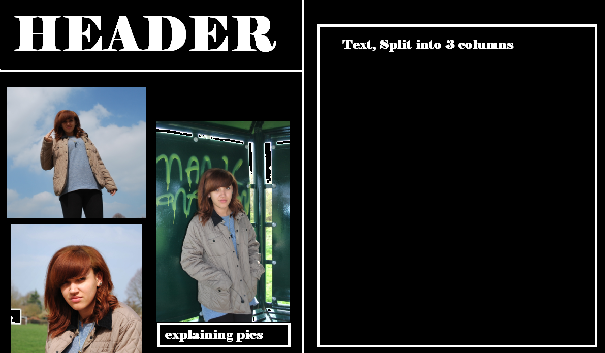
We both decided that the skate park was a good place to take the pictures for our magazine. The reason for this is because at this one, like most skate parks, there is a lot of graffiti, and this gives it a very urban look. We thought this would be relevant for our magazine, because our music magazine is focusing on urban/rap music. The picture is an eye-level medium shot. We did not manipulate the photographs we took in Photoshop; we just cropped out the background in some of them. The reason we cropped out the background was so the actual model herself would capture the attention of readers, not the background.

The outfit that Jenai is wearing the picture was not particularly planned, she just wore what she felt would relate to our magazine. She settled with a simple grey/blue jumper, beige coat, leggings and chestnut uggs. 


The main feature in our magazine was Jenai herself. There was no particular reason for this, just our other model couldn't make it to the shoot, so Jenai stepped up. But the fact that Jenai is a teenager, might attract teenagers to the magazine. Also, the fact that she is a female, might attract more males to the magazine. 


The font we decided on for the masthead is a font used by a group called 'BBK' which stands for 'Boy Better Know'. Jenai and myself enjoy listening to there music, and we also like the font used to write 'Boy Better Know' and this is the reason we chose that font. For the rest of the writing, for example the contents or the interview or stories on the double page spread, we used just a simple font. This is so it's easy for everyone to read, and doesn't take the attention off of the images. This is in some ways following the codes and conventions of real music magazines. Most real magazines use an interesting font for the masthead or headlines etc, but then for the main articles and things, they use simple fonts.


On the front cover, contents and double page spread, we didn't use particularly formal language, but it wasn't informal either, it was just average. Even though we were mainly trying to target people who like rap, we want to also attract people enjoy other genres, so we didn't set a particular tone to our writing. 


Genre is reflected well in our magazine, because even though stereotypically rap is for males, our model is a female. Also the main story is about a female rap group. This will attract males to the magazine because obviously there are pictures of females and thats what males like to see. Also, females will be attracted to it, because the pictures will make them feel like they can relate if they listen to that kind of music. 


Firstly, the front cover. It is very much following the codes and conventions of real music magazines. As you can see the bar code is placed in the bottom right hand corner. This is just like on a real music magazine. Also the main cover image is placed in front of the masthead.. This is also following the codes and conventions. We didn't deliberately do this to make it look like other magazines that is just the way it turned out. Also the contents page is in some ways following the codes and conventions. There is a part which says about subscribing, which you would usually find on the contents page in real music magazines. And lastly, our double page spread doesn't follow any of the codes and conventions of a real music magazine.


Overall, we have mostly  followed the codes and conventions instead of challenging them, but this doesn't mean we haven't challenged them in some areas.  The reason we mostly followed the codes, is so that we didn't dissatisfy the audience who we were trying to attract. Because obviously audiences have expectations, and if we challenge the codes and conventions too much, the audience could easily be disappointed which is what we don't want.