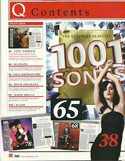
Layout: As you can see, this contents page is a little unorganised. I think it is only half of it, because it doesn't look like a full contents. Also, it is not as attractive as other contents pages as there are not many pictures, and lots of writing. The main image is of Kate Perry, in a pose that is likely to attract men to the magazine.
Mode of Address: It appears that this contents is coming across to the audience as informal. The reason i believe this is because it says '...listening pixie goes bonkers.' bonkers is a word that isn't likely to be used in a formal conversation.
House Style: On this contents, the same font has been pretty much maintained throughout, except one thing. But even though the fonts are the same, they are of different sizes and styles. This makes the contents look smarter than if they were to use many different fonts.
Lure: The lure on this contents, is Kate Perry. The way she is posed is somewhat 'seductive' meaning men will be more likely to read it. The only problem with this, is that there is nothing luring female into the magazine.
Editorial&Subscription: As you can see from the image above, this magazine doesn't follow the codes and conventions. The reason for this is that there is no section offering the readers to subscribe to this magazine. Also there is no part showing an editors letter, which is what some magazines do.
Layout: It is clear that the layout of this contents is better than the previous one. It is easier to read, and even the the main image is very boring it is still altogether a better layout.
Mode of Address: The contents page isn't clear enough to read it all, but from the bits that I can read, it seems formal.
House Style: With this contents page, they have used pretty much the same font all over, with maybe a few exceptions.
Lure: This contents page, doesn't actually have a lure,
Editorial&Subscription: Unlike the previous contents page, this one partly follows the code and conventions, as there is a paragraph at the bottom about subscription. This increases the amount of magazines they will sell. This is overall making them a profit.
Layout: Compared to the previous two, this contents page is more interesting to look at. The reason for this is because there are more images which grab the attention of the reader.
Mode of Address: It appears that this magazine is very formal. The reason i believe this is because it says "I've done many things with my pubic hair..." and this is not a formal way to speak to the audience, it's much more casual.
House Style: On this contents page, all of the fonts used are very similar, but not all exactly the same.
Lure: The lure of this contents page, is the piece underneath the title, where 'Rob Flynn' from a bang called 'Machine Head' made a confession, but only one sentence of the confession is shown, as a teaser. The reason this is a lure, is because it makes whoever is reading the magazine, want to read ahead and find out the full confession.
Editorial&Subscription: This contents page includes both an editorial and a subscription. The editorial is in the top left, and the subscription part is in the bottom right.
Layout: The layout of this contents is very attractive for females because obviously females like make-up a whole lot more than boys do. It is also very clear and simple, and easy for the audience to read.
House Style: The main colour used here is pink, from the make-up products to the writing. And also the fonts are similar.
Lure: The lure of this contents page is obviously the pictures of the make-up products for females. Females may like to read the magazine to find out which products are best and which products are newest out and worth purchasing etc.
Editorial&Subscription: In the bottom right hand corner is the editorial. This is following the codes and conventions of other magazines.
Layout: This layout is very simple but clever. As you can see it is of Ciara in a fairly seductive pose, with the actual contents of the magazine written above her.
House Style: There is no particular house style here. A number of different fonts have been used to give the contents page variety. And also there is no colours used throughout, just different ones. But the colours seem to be duller colours like grey and brown.
Lure: The lure is obviously the main image. As Ciara looks a bit seductive it will very much attract males to the magazine.
Editorial&Subscription: This particular contents page does not include an editorial or information about subscription.


No comments:
Post a Comment